
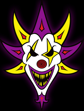
The Mighty Death Pop has changed once again. Nothing big, just the purple/yellow parts are red now. I don’t know if it looks better but check it out for yourselves! Here’s the new image of The Mighty Death Pop!:

and here’s an old image:

and older:

…and older:

We’ll keep you posted if anything changes ;)


Faygoluvers Comments
SCROB
Comment posted on Thursday, June 14th, 2012 04:26 pm GMT -5 at 4:26 pm
Wish the changes were bigger. The mouth looks to simple, like a moon shape.
Carnivalkilla44
Comment posted on Thursday, June 14th, 2012 08:12 pm GMT -5 at 8:12 pm
Still like the second one with the pink the best. Shouldn’t be changing it so much, IMO. When it finally comes out who knows what it’ll look like.
wonka69
Comment posted on Thursday, June 14th, 2012 09:06 pm GMT -5 at 9:06 pm
hopefully, it will morph into sumthing that looks truly wicket !
cokanostradamus
Comment posted on Friday, June 15th, 2012 01:08 am GMT -5 at 1:08 am
Ya i like all the changes they have made,i was down with the first one from the huge banner at hollowicked 2010 though.and they got some sick Death Pop shirts at hatchet gear now, ima get the white one
VoiceNameless
Comment posted on Saturday, June 16th, 2012 03:49 am GMT -5 at 3:49 am
I think the first one looks best, but if they kept it how it is now it wouldn’t matter. Maybe keep the spikey parts that are purple red in the middles? Like the hidden “11” and “63” too =P
wonka69
Comment posted on Wednesday, June 20th, 2012 11:00 pm GMT -5 at 11:00 pm
maybe the beard, with the cross, will morph into a body ? look-a-like colonel saunders.
You must be logged in to post a comment.